Introduction
My Online Store
My Online Store is a website product offered for myPOS customers which allows them to sell their products from their existing POS systems online.
cp-admin) and this guide is designed to explain how to perform a number of important tasks in keeping your website up-to-date.Continue on through this guide and how to get the most out of your online store
Get Started
Getting Started
/cp-admin at the end of the address. For example if your website's address was www.localbottleshop.com.au your admin panel could be accessed through www.localbottleshop.com.au/cp-admin.From the admin panel you can change a variety of settings and styles for your website, including but not limited to:
- Shop Opening Times
- Shop Name
- Shop Accent Colour
- Font Slider Images
- Navigation Bar
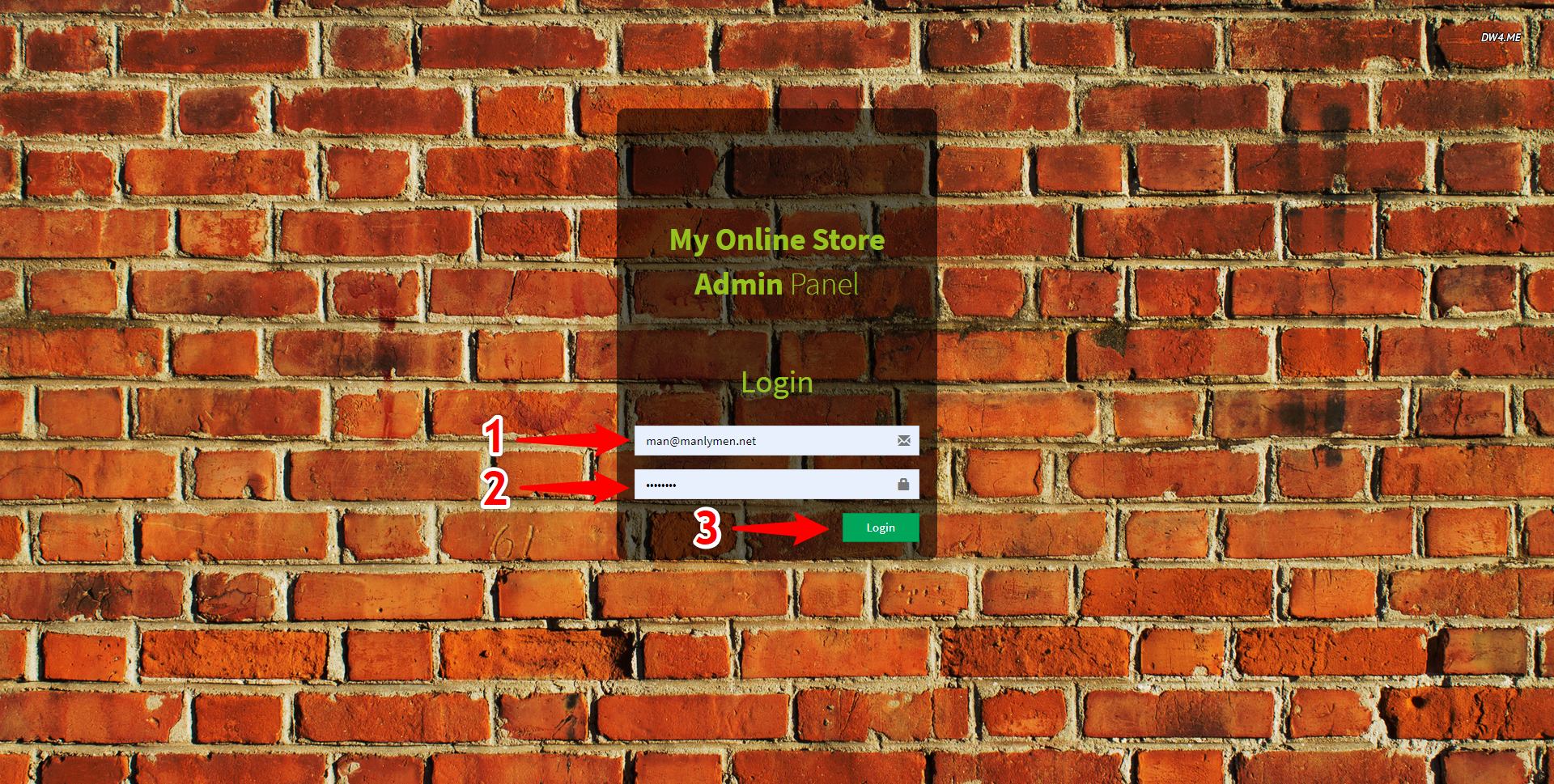
Logging In
To access the Admin Panel for your website you must first Login using your administrator username and
password.
To Login follow these steps:
Figure 4.1 - Login Interface
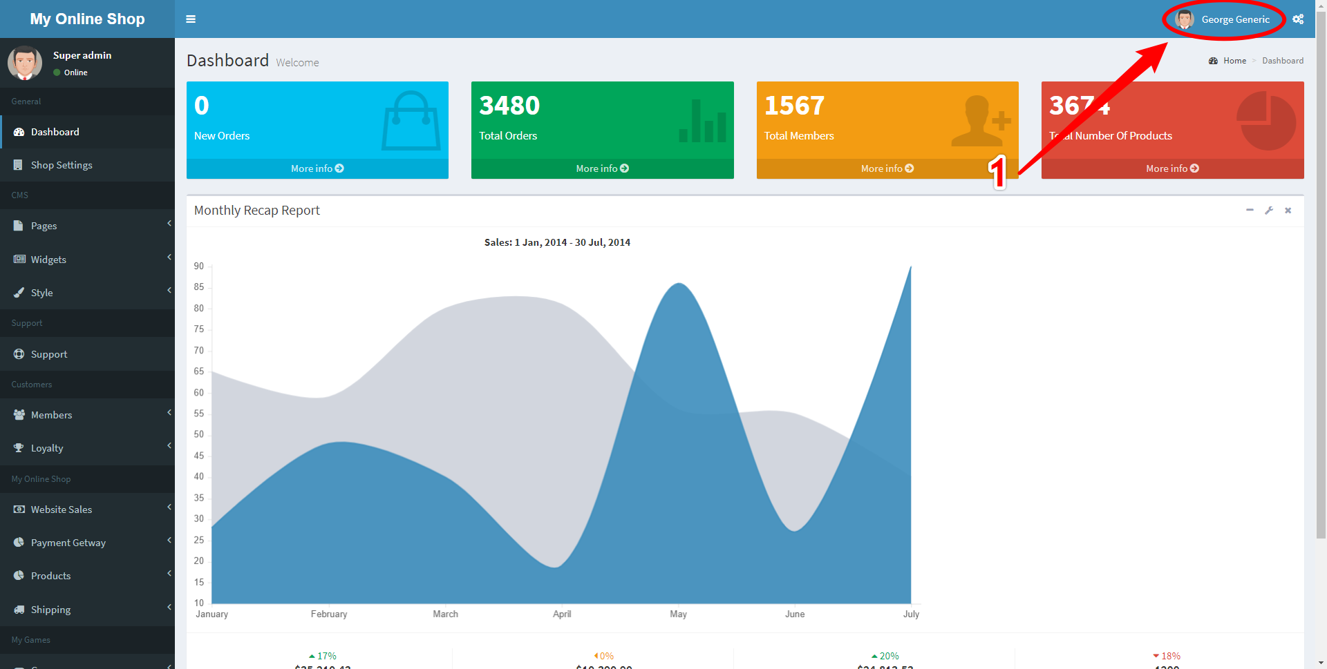
Logging Out
It is important to Log Out from the Admin Panel when it is not in use to help keep your website
secure.
To Log Out follow these steps:
- Click the User button in the Top Right Corner Marked 1
Figure 5.1 - User Menu
- This reveals the User Menu, click the Log Out button Marked 2
Figure 5.2 - Logout Button
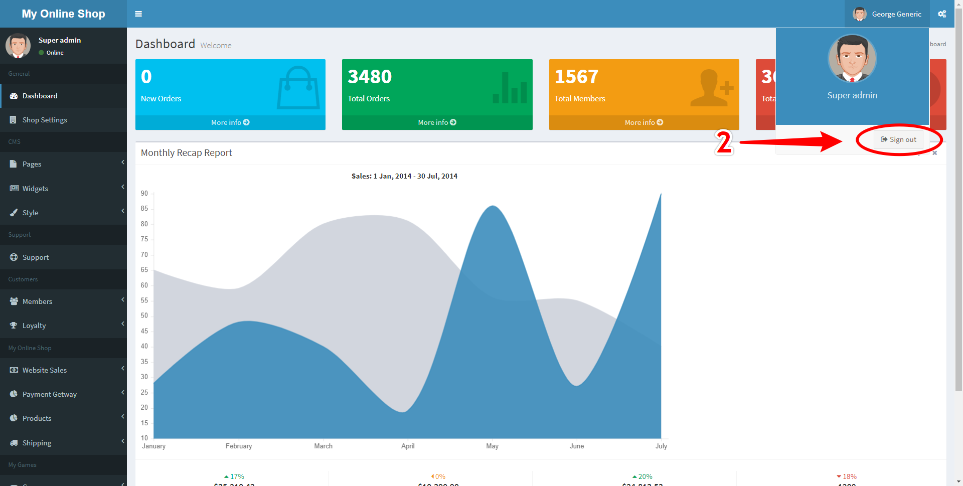
You will now be returned to the Login screen seen in section Logging In
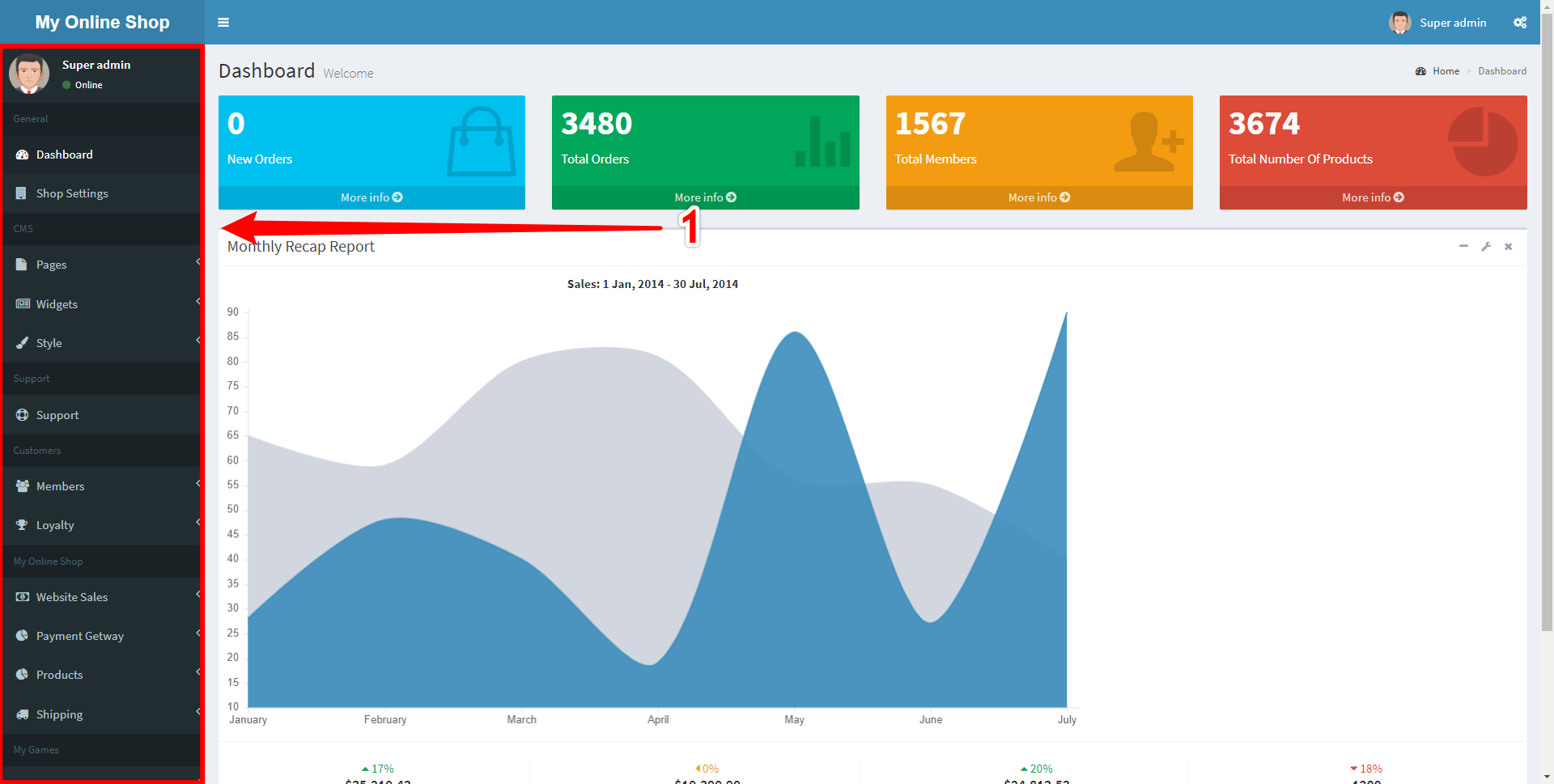
Getting Around
To navigate around the Admin Panel you can use the Navigation Sidebar located on the left side of the screen.
The navigation is divided into groups based on use case, and those groups consist of links, some of which contain sublinks.
By clicking on a link it may take you to a page or reveal sublinks depending upon whether there is a small arrow to the right of the link's name.
Figure 6.1 - Navigation
The Navigation section is divided up into:
- The Dashboard - Showing useful statistics
- Shop Settings - Allowing you to change displayed information for your online store
- Pages - Edit Pages, Navigation and Images
- Widgets - Edit Sliders & News and create custom widgets
- Style - Edit colour and layout settings
- Support - Send support tickets to the support team
- Documentation - Access this very document
- Members - View site members; your customers
- Loyalty - Access and edit information regarding loyalty points
- Website Sales - Track Sales, Edit Email Messages and Payment Options
- Payment Gateway - Toggle and Edit different payment methods
- Products - Edit Products, Departments, Sales and more
- Shipping - Edit Shipping details and options
Basic Actions
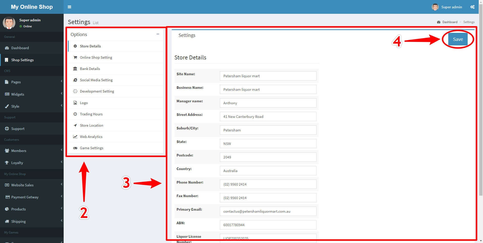
Store Details
To Edit your store's details click the Store Settings navigation button on the Navigation Menu to the left.
Figure 7.1 - Store Settings Link
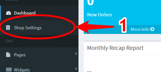
Figure 7.2 - Store Settings Page
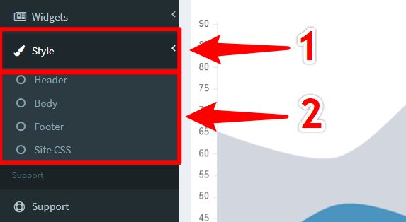
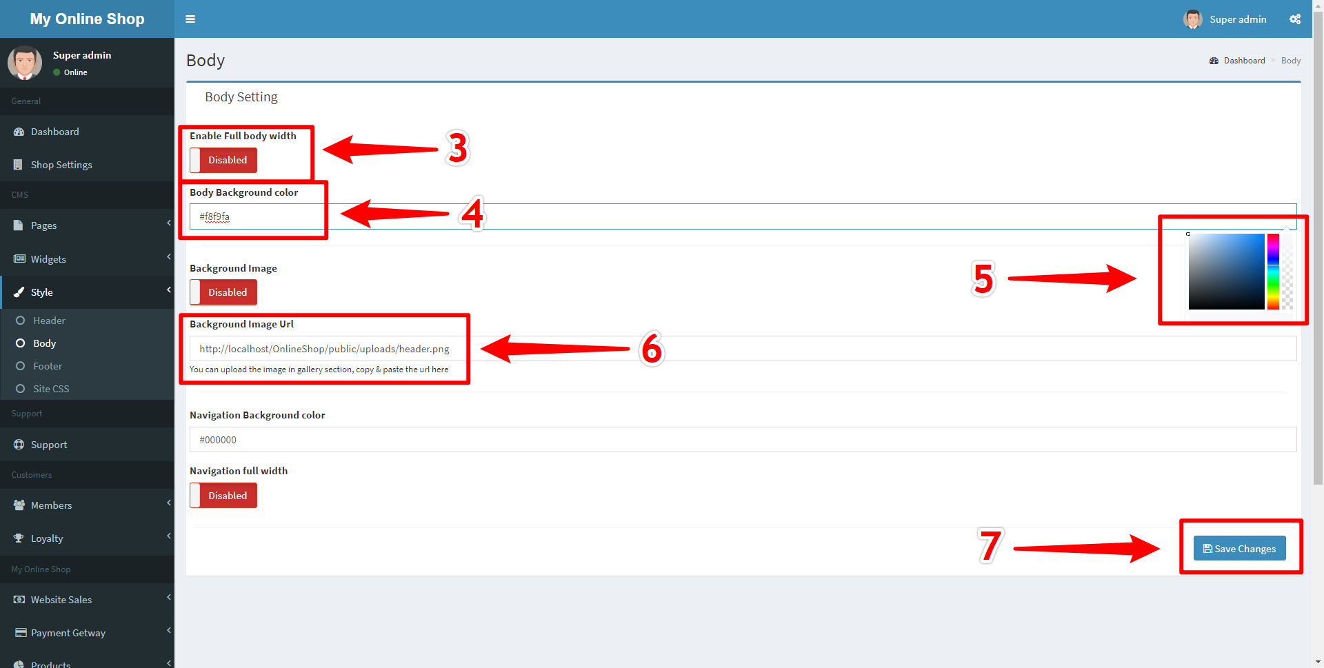
Customising Styling
Figure 8.1 - Styling Navigation Link
- Toggle Switches (Marked 3)
- Colour Input (Marked 4)
- Colour Picker (Activated by clicking in the Colour Input) (Marked 5)
- Image Uploader (Marked 6)
Figure 8.2 - Header Styling Settings
For more information on styling options see Styling Options
Changing Page Contents
Figure 9.1 - Navigating to Pages Section
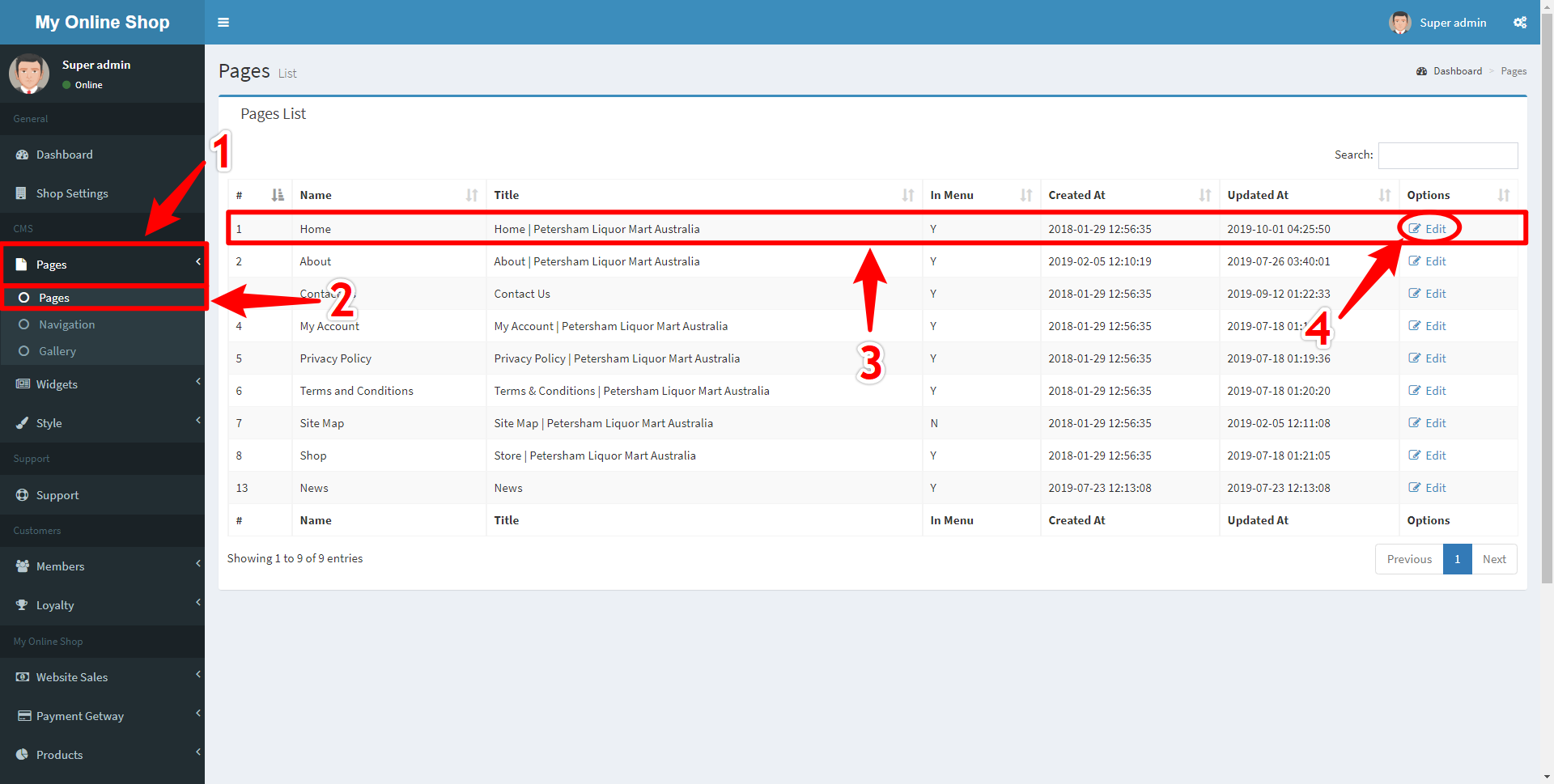
Figure 9.2 - Edit Page Section
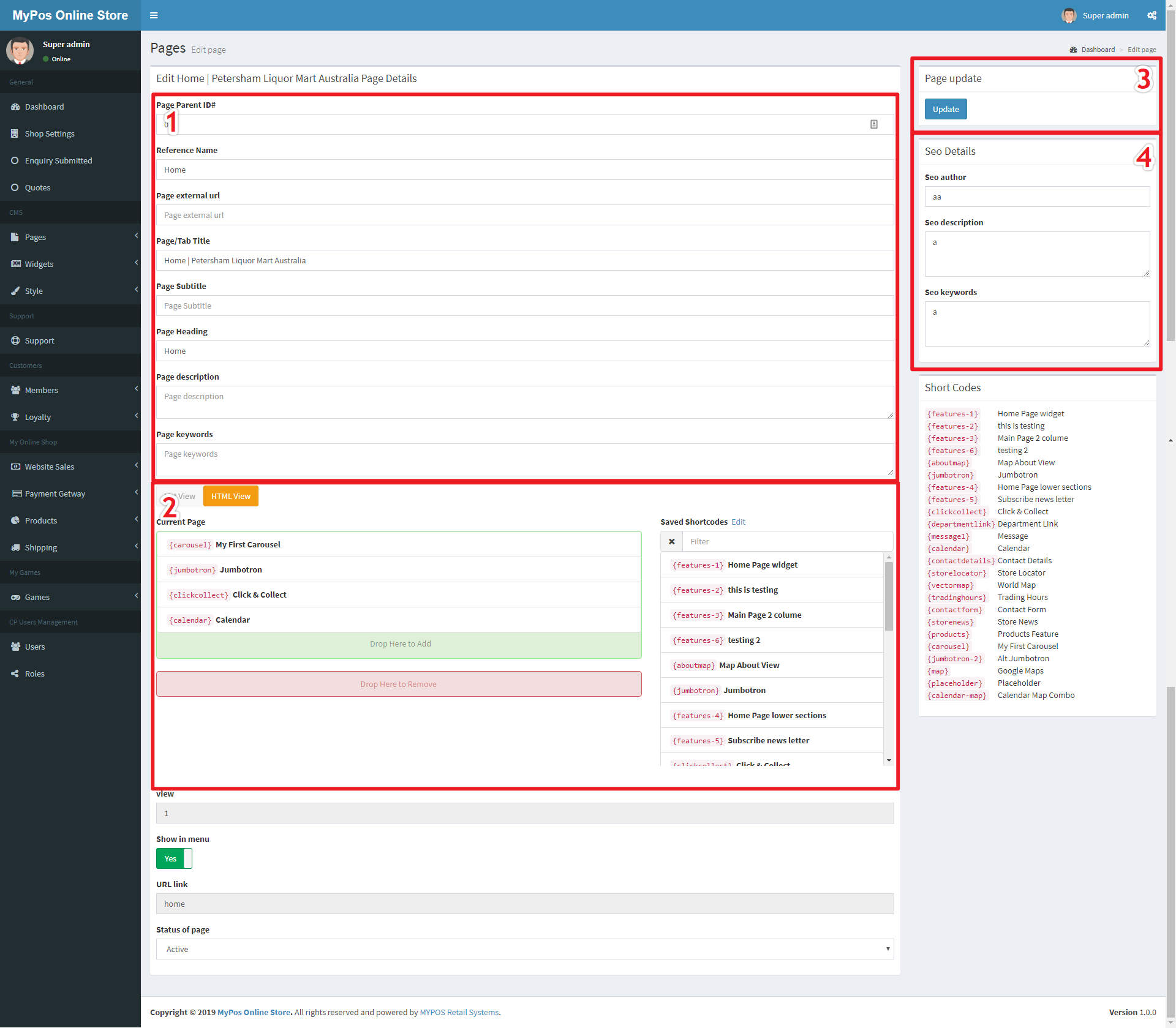
The Page contents List View shows the contents of the page in terms of Widgets, which make up the entirety of a normal page.
Figure 9.3 - Edit Page List View
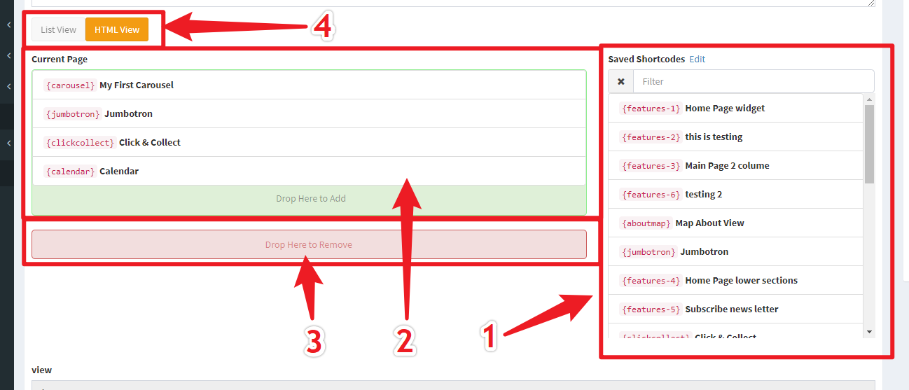
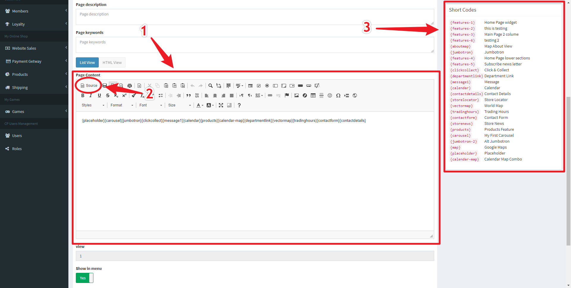
Alternatively the HTML view can be used to directly edit the page contents using HTML, however this is only recommended for advanced users with experience in both HTML and the Bootstrap 4 library.
Figure 9.4 - Edit Page HTML Editor View
Editing News
Figure 10.1 - News Page
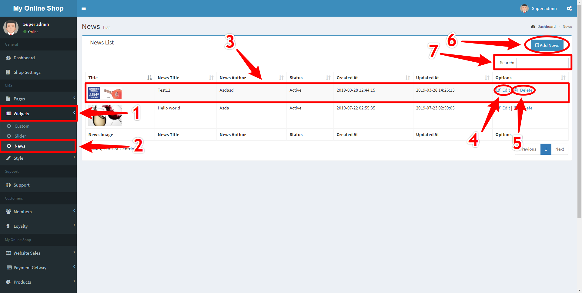
Once editing a news article you can add an image using the Image Picker to choose an image from your gallery (see Uploading Images)
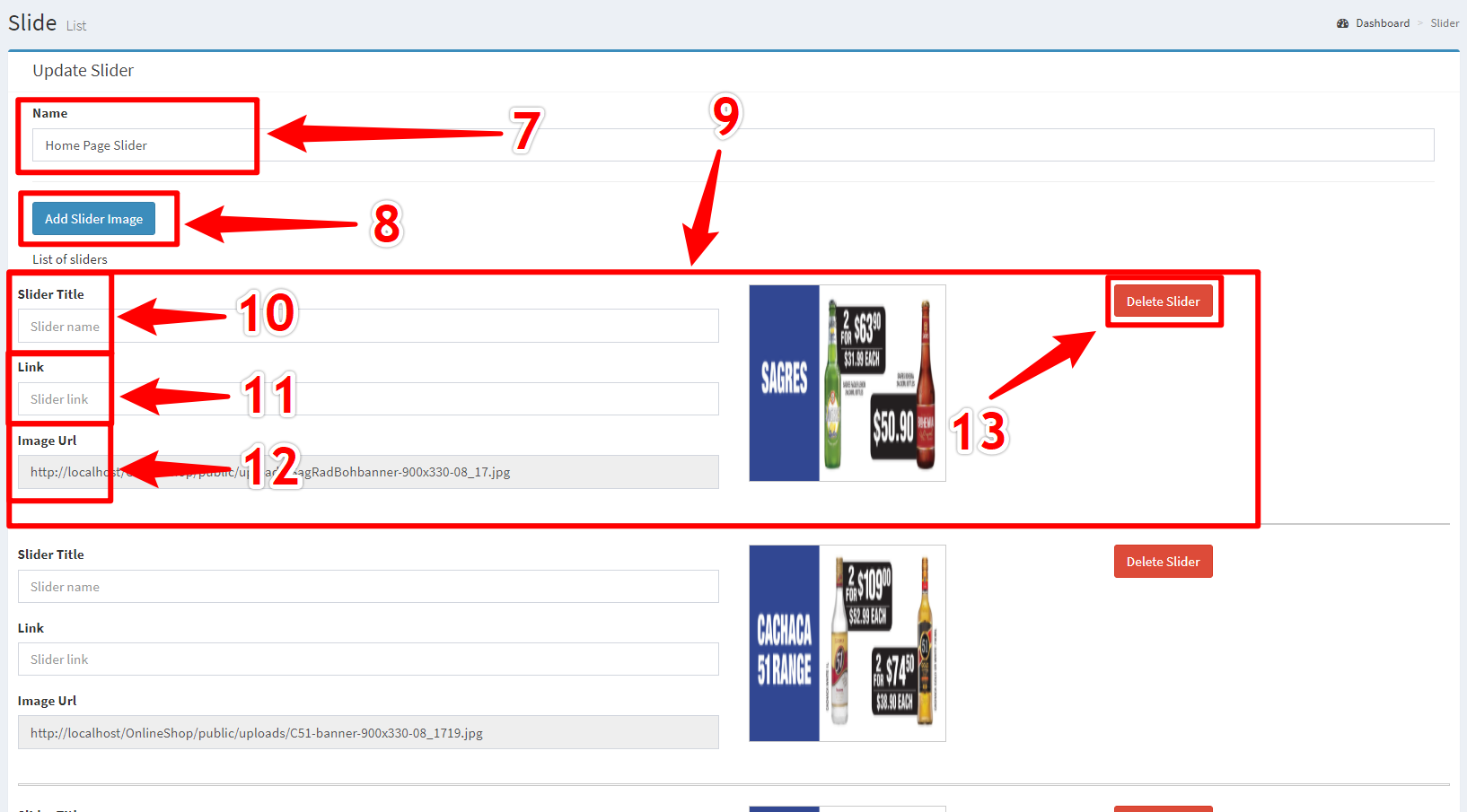
Editing Legacy Slideshow
Figure 11.1 - Edit Sliders Page
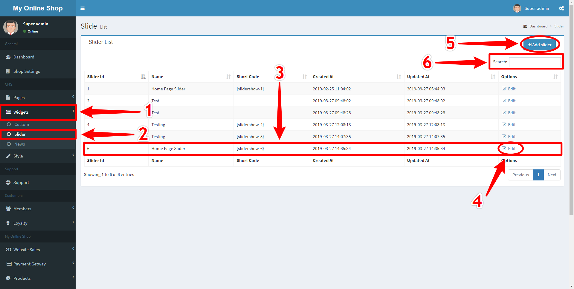
Figure 11.2 - Edit Sliders Page
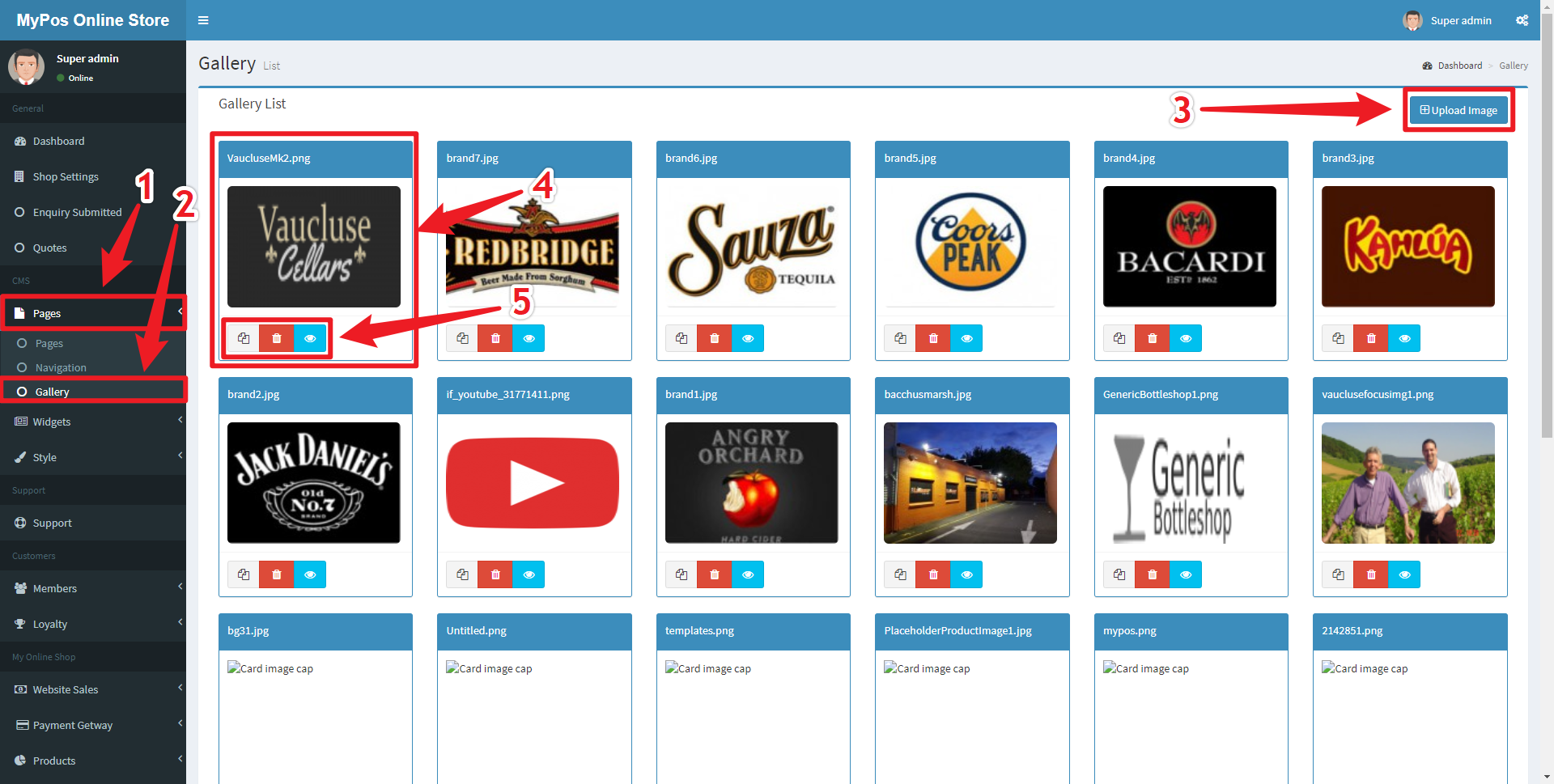
Uploading Images
Most often sections that require an image will provide an select image Button which will bring up the Image Selection Overlay, allowing for the uploading and selecting of images.
Figure 12.1 - Image Selector Overlay
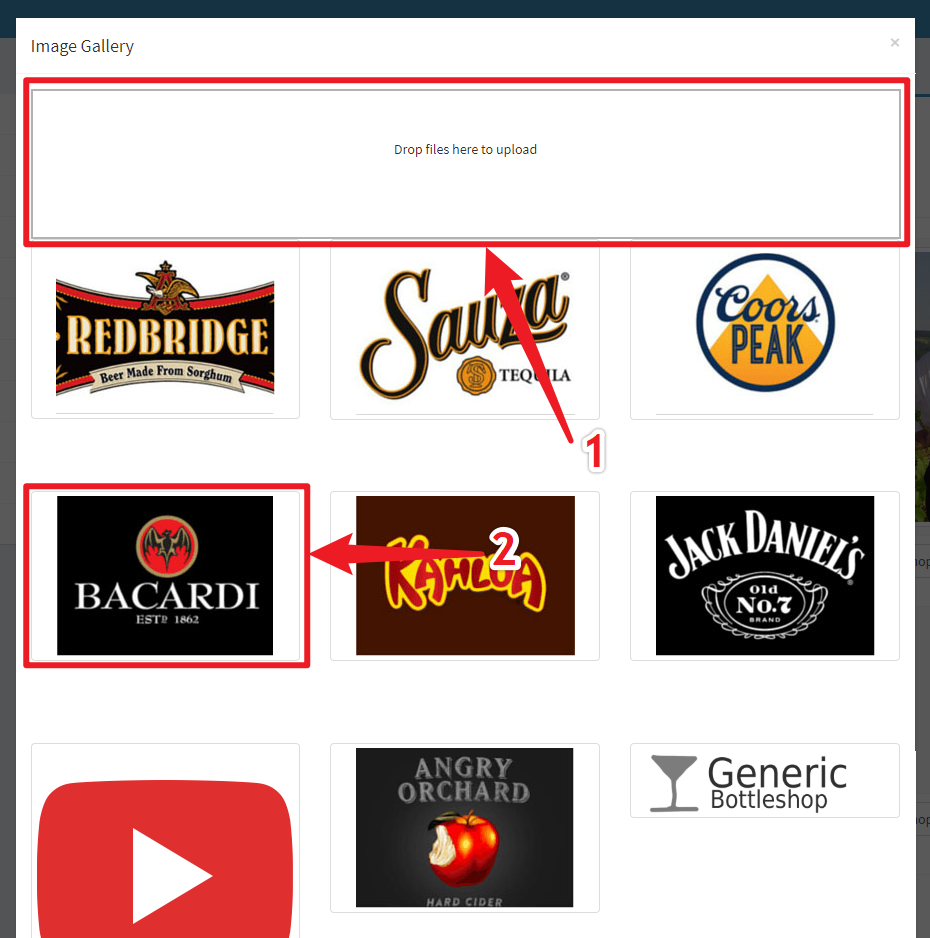
Figure 12.2 - Gallery Page
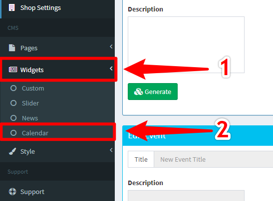
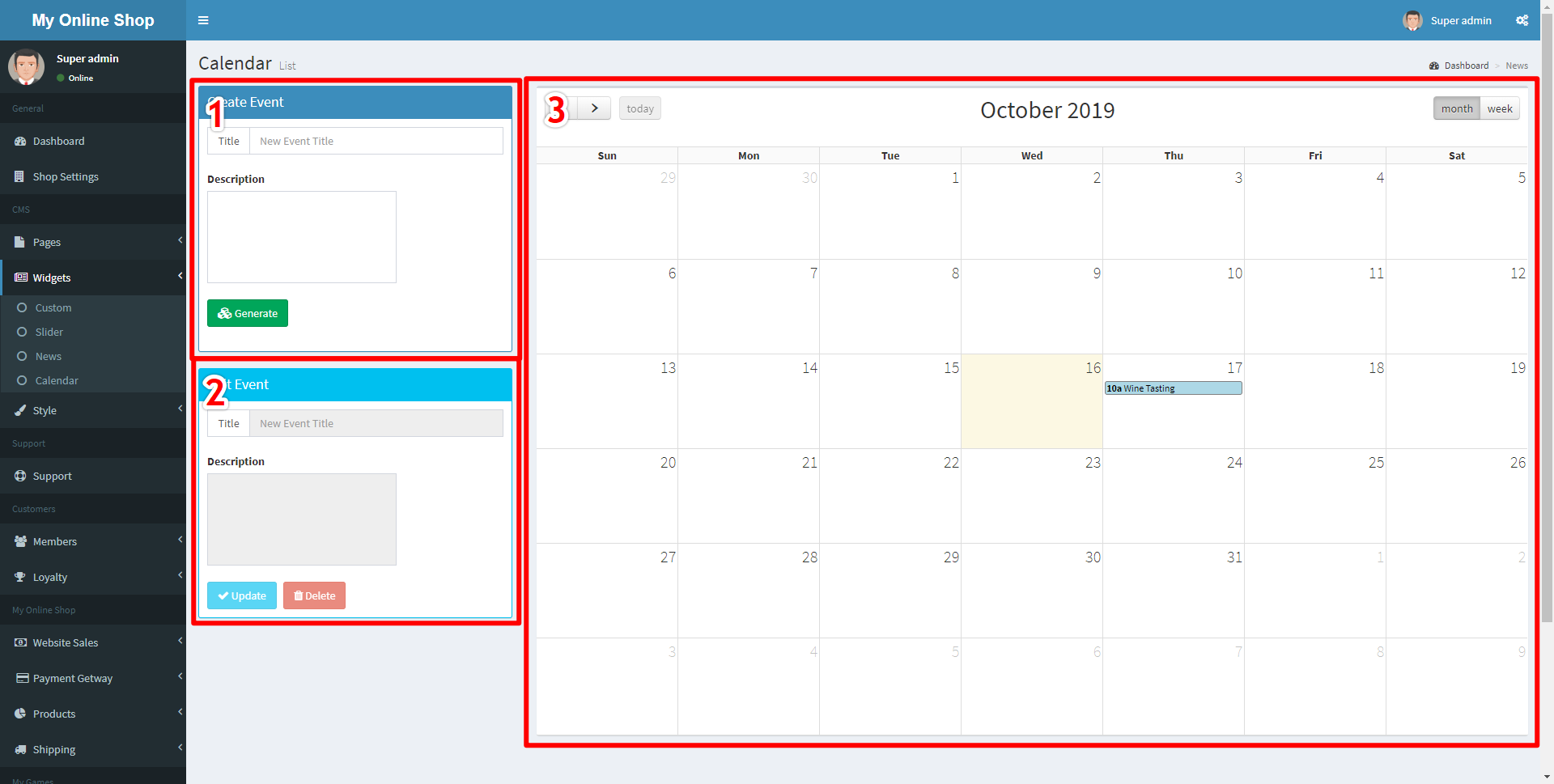
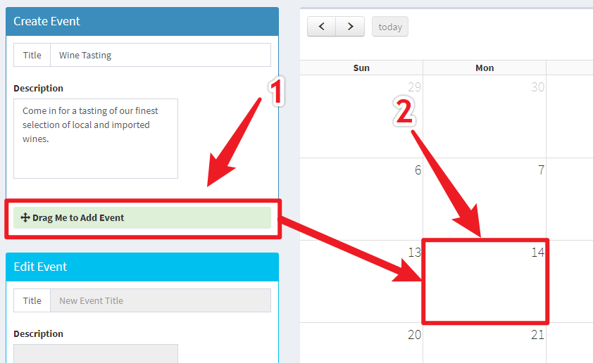
Adding Events to the Calendar
To Navigate to the Calendar click on the Widgets Navigation Link (Marked 1) and then the Calendar Sublink (Marked 2)
Figure 13.1 - Navigating to Calendar Editor
The calendar section contains three sections for different tasks.
Figure 13.2 - Calendar Screen Overview
Within the Event Create Box there are fields to add data to your event before adding it to the calendar.
Figure 13.3 - Creating Event
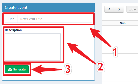
Figure 13.4 - Adding Event to Calendar
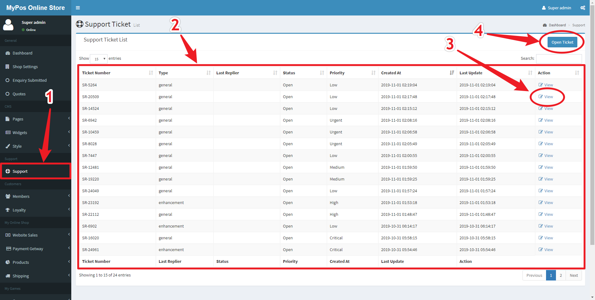
Sending Support Tickets
To Submit a support ticket to the Support Team, you can do so by navigating to the Support page. Do so by clicking the Support Navigation Link (Marked 1).
Figure 14.1 - Support Page
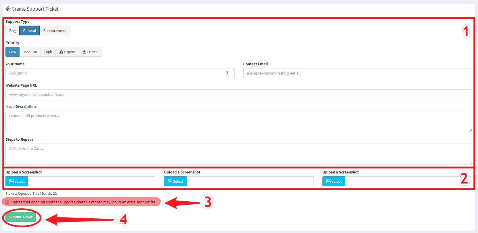
On the open ticket page you can create a new support ticket by inputting the relevant information.
Figure 14.2 - Open New Ticket
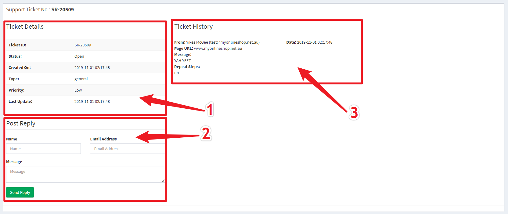
On the Ticket View page the Ticket Information (Marked 1) is shown alongside a Reply Field (Marked 2) which allows you to have back-and-forth between you and the support team.
Figure 14.3 - Support Replies Page
Viewing Sales
Navigate to Website Sales > Sales on the side navigation bar to bring up all website sales.\
Figure 15.1 - All Sales View
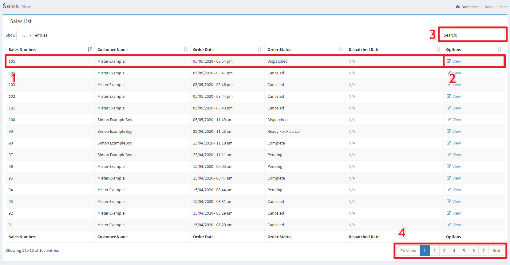
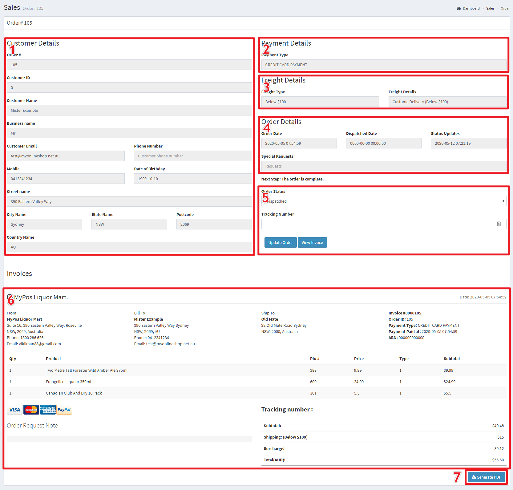
By viewing a sale the various aspects of that sale can be seen. The Customer's Details (1) as entered when they checked out, the customer's Payment method of choice (2), the freight choice (3) and any other information relevant to the order (4).
Figure 15.2 - Viewing Sale
Advanced Guides
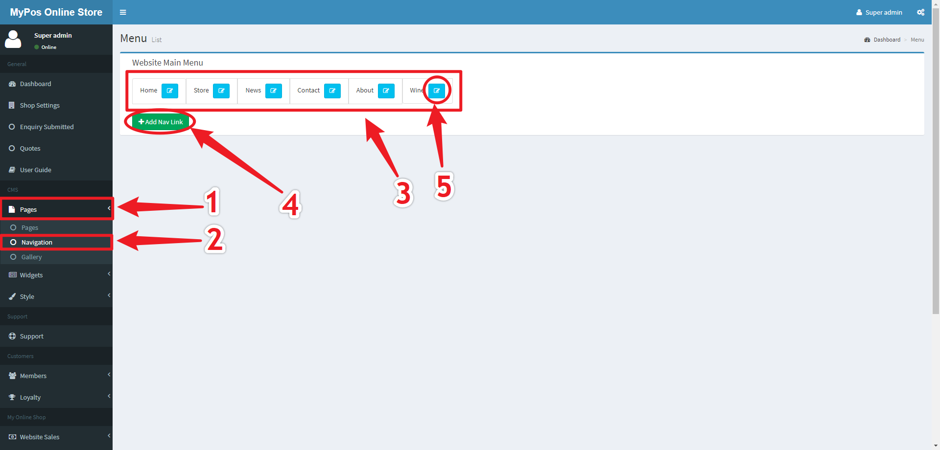
Editing Navigation Bar
To Edit the navigation bar you first navigate to the Pages Navigation Link (Marked 1) and then the Navigation Sub Link (Marked 2).
Figure 16.1 - Navigation Location and Menus
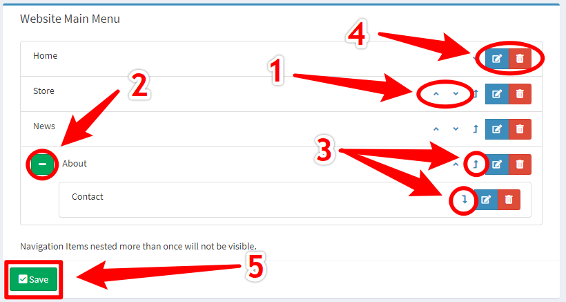
In the 'Website Main Menu' window the order of the links can be changed either by clicking and dragging to move each row or by using the Up and Down Buttons (Marked 1).
To show or hide child elements of navigation menu items you can click the Green +/- Button (Marked 2) next to the link's name. Links can be made into child elements either by dragging them into the child position underneath their proposed parent or by using the Parent and Unparent Buttons (Marked 3). Note that navigation links that are grandchildren (nested two deep) will not appear on the website.
The Links themselves can be modified and deleted using their respective Modify and Delete Buttons (Marked 4).
Any changes made to the navigation layout must be saved with the green Save Button (Marked 5).
Figure 16.2 - Editing and Organising Window
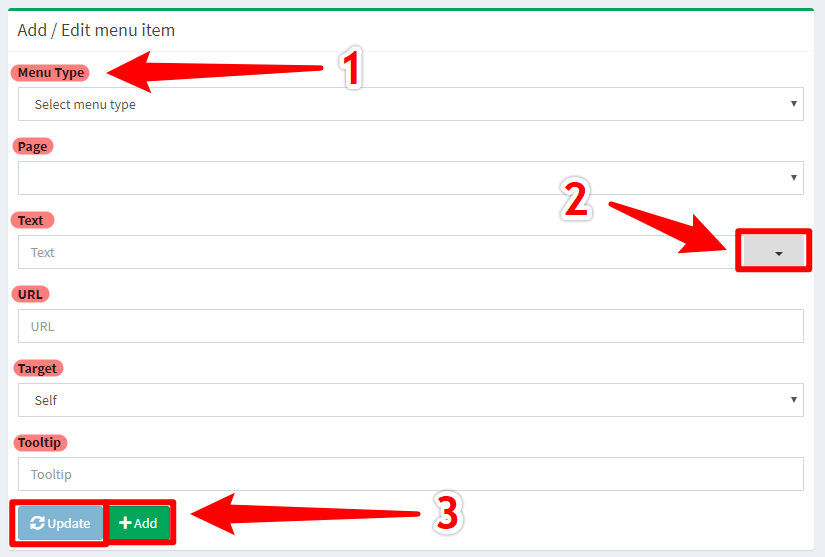
The Add / Edit Menu Item window can be used to either update or create a new link for the navigation bar.
- Menu Type - Either Page or Custom. Page type allows for the use of a preexisting page while custom type allows for the use of a custom URL within the website (e.g. Contact)
- Page - Used only for Page type links, this provides a list of pages to link to within the website
- Text - The displayed text which shows on the navigation bar
- Icon (Marked 2) - Allows you to choose from a selection of icons to be displayed on the navigation bar alongside the text
- URL - Used only for custom type links, this allows you to define a custom URL within the website to link to on the navigation bar (e.g. Beer)
- Target - this defines where the link destination will appear, e.g. Self will have the link appear in the same browser Tab (default), Blank will appear in a new browser tab and top will appear over the current tab.
- Tooltip - this is a helpful message to elaborate on where the link goes to.
Figure 16.3 - Creating and Editing Links Window
Editing Products
Coming Soon
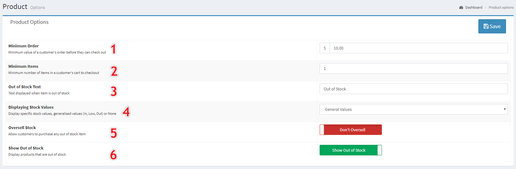
Store Settings
To find the Store Settings, navigate to My Online Shop > Store Settings on the side navigation bar.
- Specific Stock Values - Show the specific amount of stock available for every product
- Generalised Values - Show "In Stock", "Low Stock" (Less than 6 of that item), and Out of Stock
- No Values - Do not show stock to customers, however they can still not purchase more than is in stock
Figure 18.1 - All Store Settings
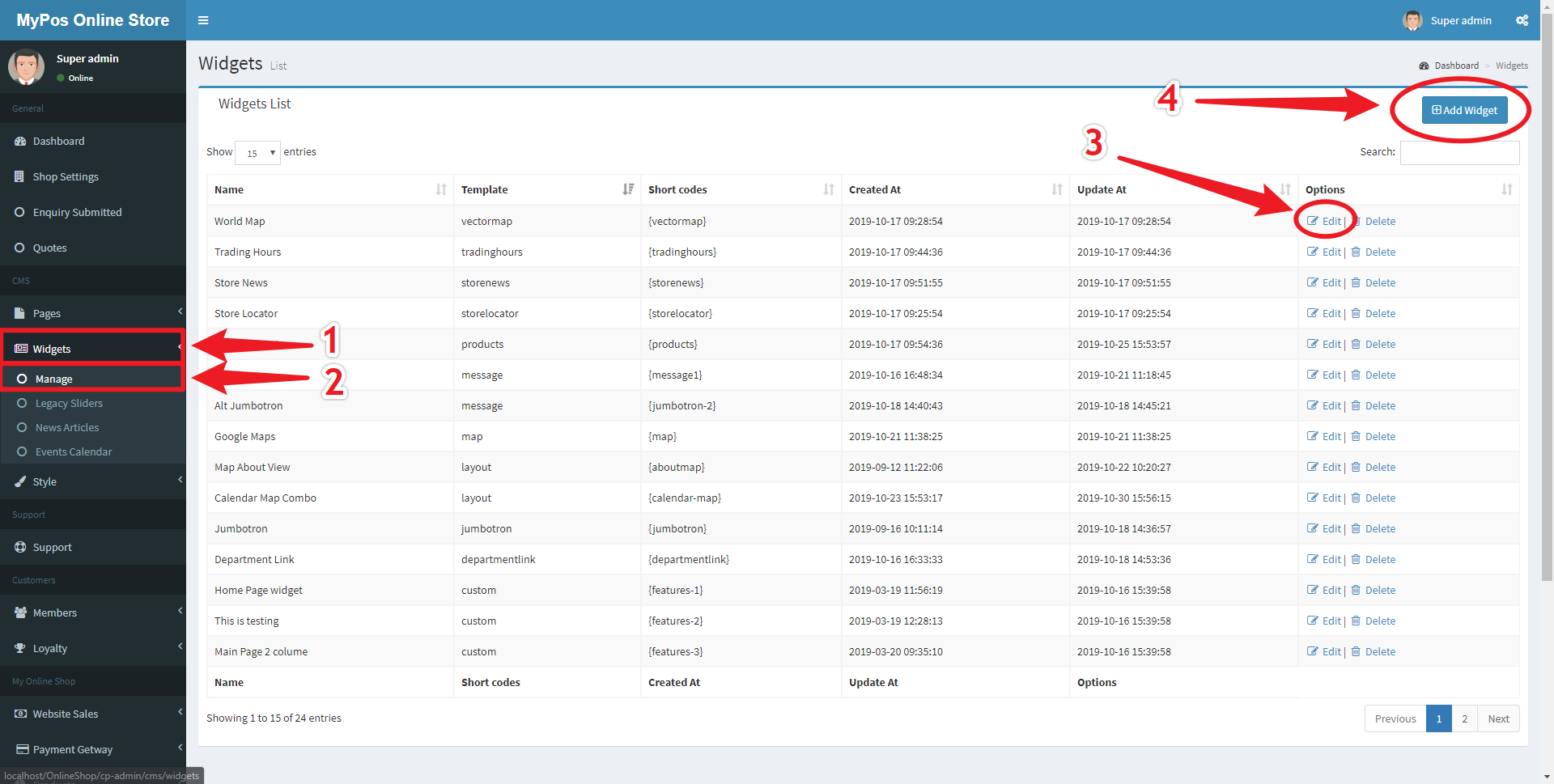
Adding and Editing Widgets
Most pages within the store are build from Widgets, many of which can be created and edited from the Widgets Screen.
Figure 19.1 - Manage Widgets Page
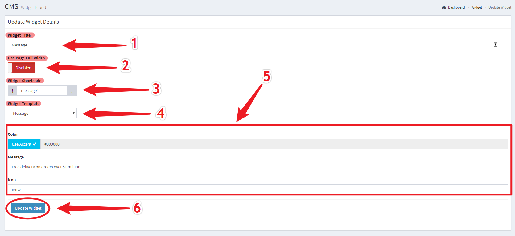
Adding and Editing widgets use the same interface which allows for the selection of a Widget template and provides relevant settings fields for that template.
- Widget Name (Marked 1) is used for your own reference so it is advised that a descriptive name is used.
- Full Width Toggle (Marked 2) is used to determine whether the widget will extend to the sides of the webpage or whether it will have margins on either side.
- Widget Shortcode (Marked 3) is used to render the widget in the webpage, this code should be relevant and unique, however simple names such as "Slider 2" are perfectly acceptable.
- Widget Template (Marked 4) determines the template that is rendered onto the webpage, and determines what settings that widget can have.
Figure 19.2 - Add or Edit Widget
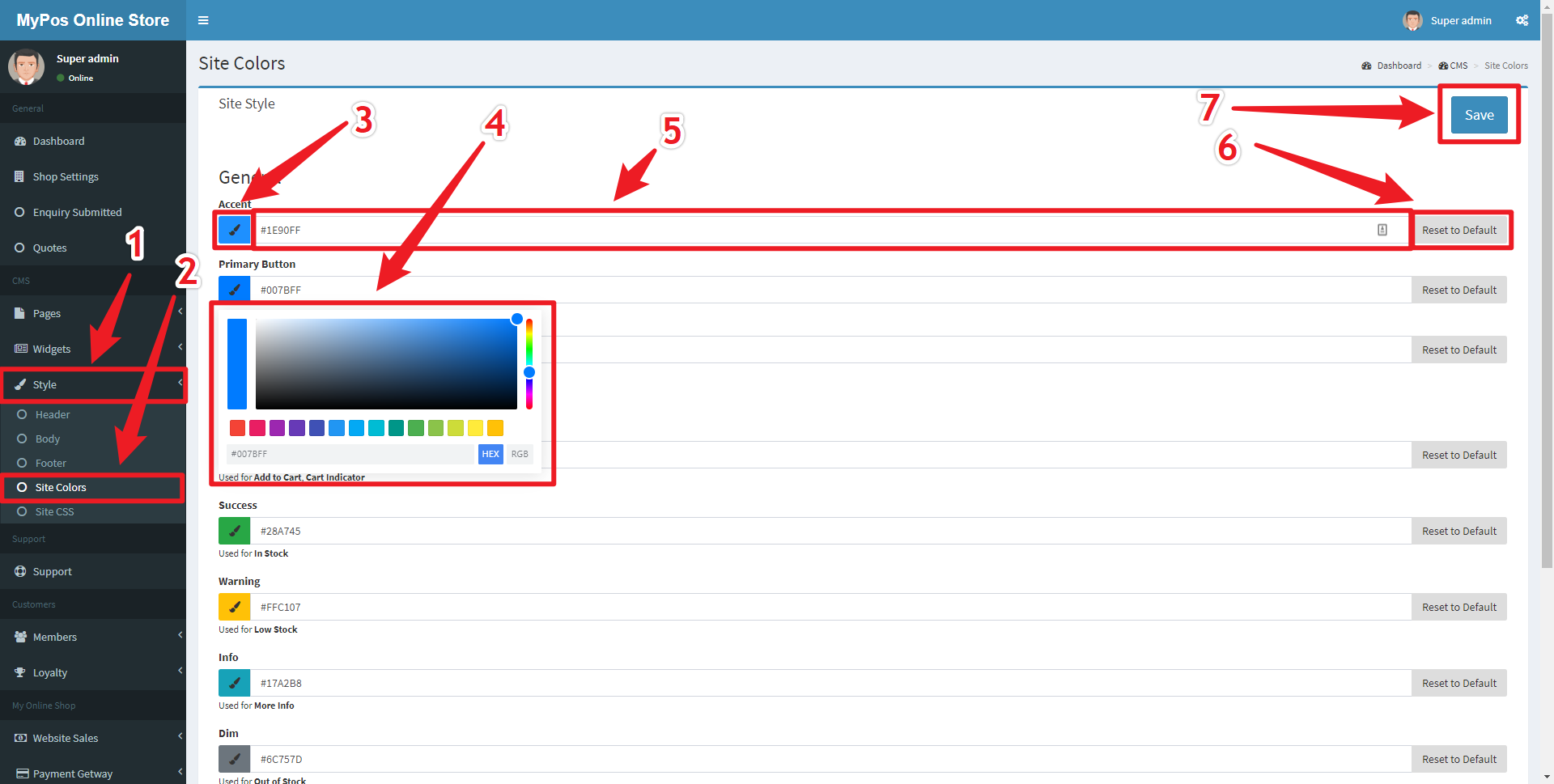
Editing Site Colours
To edit the colours used on the website navigate to the Site Colours page by clicking the Style Navigation Link (Marked 1) and then the Site Colors Sublink (Marked 2), which will take you to the Site Colours page.
- Clicking the Paint Brush Button (Marked 3) and using a Colour Picker (Marked 4) to easily choose a colour that suits
- Entering a colour value in the Colour Value Field (Marked 5) if you require a specific colour. Hexadecimal and RGB colours are both accepted.
- Clicking the Reset to Default (Marked 6) button if you are not happy with your changes.
Figure 20.1 - Edit Site Colours Page
Shipping and Delivery Zones
To provide store fulfilled deliveries or stop deliveries to specific states or postcodes you must first navigate to the Custom Rates and Restrictions section by first clicking the Shipping Navigation Link (Marked 1), within the My Online Shop section, and then clicking the Custom Rates and Restrictions Navigation Sublink (Marked 2).
Figure 21.1 - Shipping Navigation
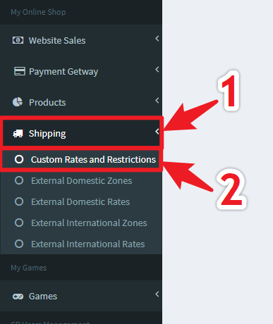
The page revealed shows different changes to be made on the left side with Store-Fulfilled Delivery Menu Item (Marked 1), Restrict Delivery Zones Menu Item (Marked 2), Courier Services Settings Menu Item (Marked 3).
Figure 21.2 - Shipping Menu and Store-Fulfilled Delivery Zones Page
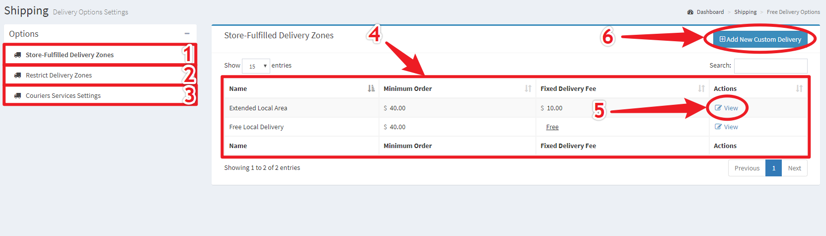
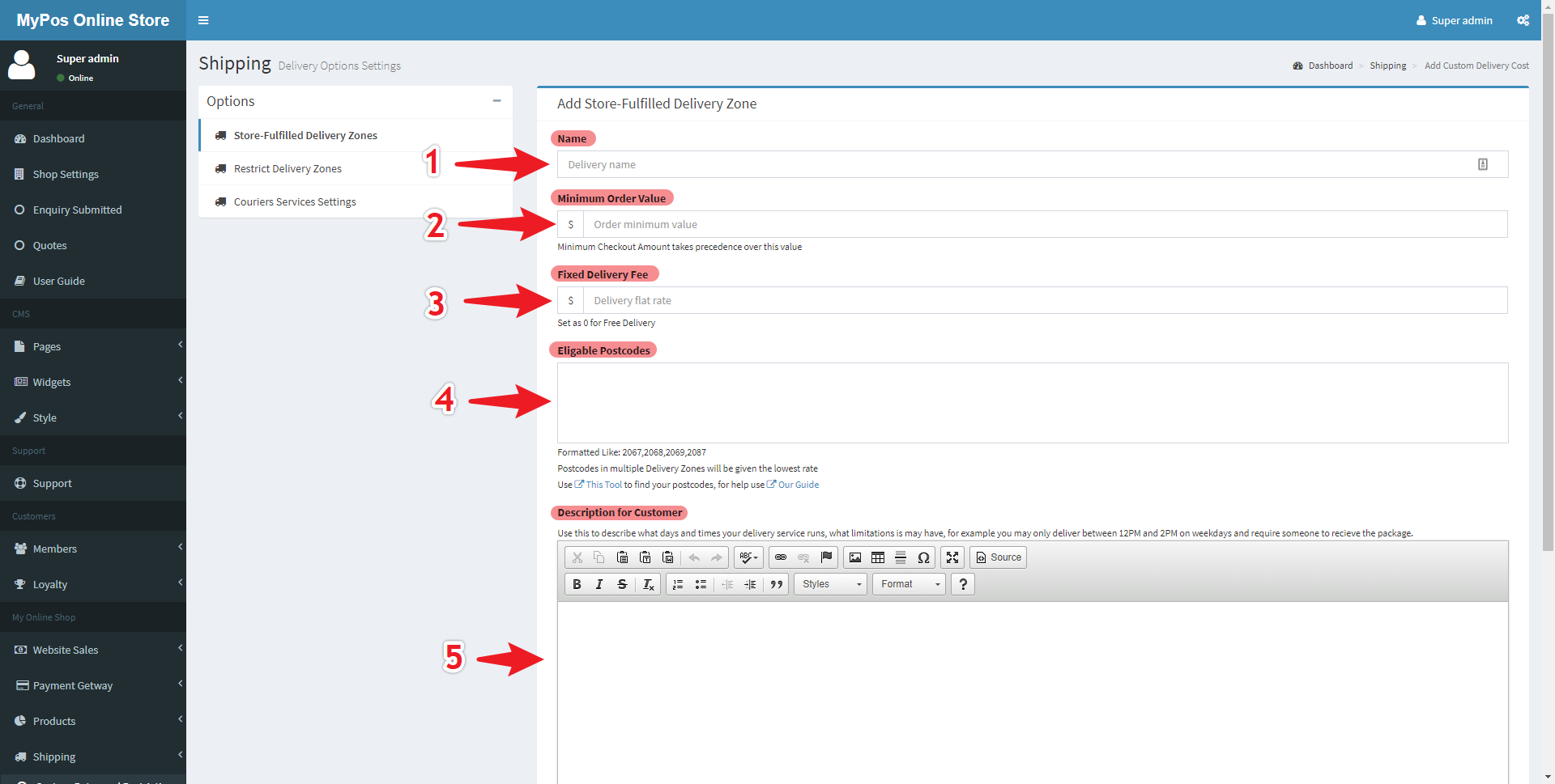
Adding and editing store-fulfilled delivery zones is achieved with the same form.
- Name Field (Marked 1) - A descriptive title for the zone, e.g. "Local Free Delivery" or "$5 Local Delivery"
- Minimum Order Value (Marked 2) - Minimum order value in dollars for this delivery option to be available, e.g. Free delivery for orders over $100.
- Fixed Delivery Fee (Marked 3) - A Fixed price for delivery within this zone, e.g. 5.00 for a flat $5 charge, 0 for free delivery.
- Eligible Postcodes (Marked 4) - A simple list of postcodes which are eligible for this delivery service, e.g. 2067,2068,2069,2087
- Description for Customer (Marked 5) - A simple description of the service provided, including potential limitations, e.g. Delivery only between 12PM and 2PM.
Figure 21.3 - Add/View Store-Fulfilled Delivery Zone
FAQ
Q: I forgot my password
Q: I was logged out unexpectedly
A: Admin Panel will automatically log you out after a specific period of inactivity, this is to protect your website if you forget to log out.
Q: My products were reset
A: The website obtains its product data from your myPOS database, and any changes made to the website will be overwritten by changes made on your myPOS terminals. This is likely the cause of product changes being reversed on the website.
Reference
Shortcodes
How They Work
Short Codes are small codes inserted into content of a page that will be replaced with a widget once displayed on the website. Multiple short codes can be placed in succession to have multiple widgets on one page.
Short Codes look like {this} and are simply references to widgets encased in curly braces { }. The text within the braces determines what is placed there, for example {Storenews} would place the store news widget in place of that code.
Some short codes are not predetermined and require an Identifying number to be placed at the end, for example to place a slideshow you will write {slideshow-#} where the # is replaced with that slideshow's respective idenfitying number, for example {slideshow-4} for the slideshow whose identifiying number is 4.
Predetermined Shortcodes
Preset Shortcodes:
| Contact Details | {contactdetails} |
Editable in Shop Settings |
| Trading Hours | {tradinghours} |
Editable in Shop Settings |
| Vector Map | {vectormap} |
Not Editable |
| Google Maps | {map} |
Editable in Shop Settings |
| Contact Form | {contactform} |
Not Editable |
| Store News | {storenews} |
Editable in Widgets > News |
| Featured Products | {featuredproducts} |
Not Editable |
Dynamic Shortcodes
Dynamic Shortcodes:
| Slideshows | {slideshow-#} |
Editable in Widgets > Sliders |
| Custom Widgets | {features-#} |
Editable in Widgets > Custom |
# must be replaced with a Slideshow or Widget ID
Styling Options
Header Styling Options
Header Styling Options
- Enable Top Header Menu - Toggles the visibility of the top header
- Full Width Top Header Menu - Toggles the width of the top header, to either have side margins or take the full width of the page.
- Top Header Menu Background - Changes the background colour of the top header
- Full Width Main Header - Toggles the width of the top header, to either have side margins or take the full width of the page.
- Main Header Menu Background Colour - Changes the background colour of the Main Header
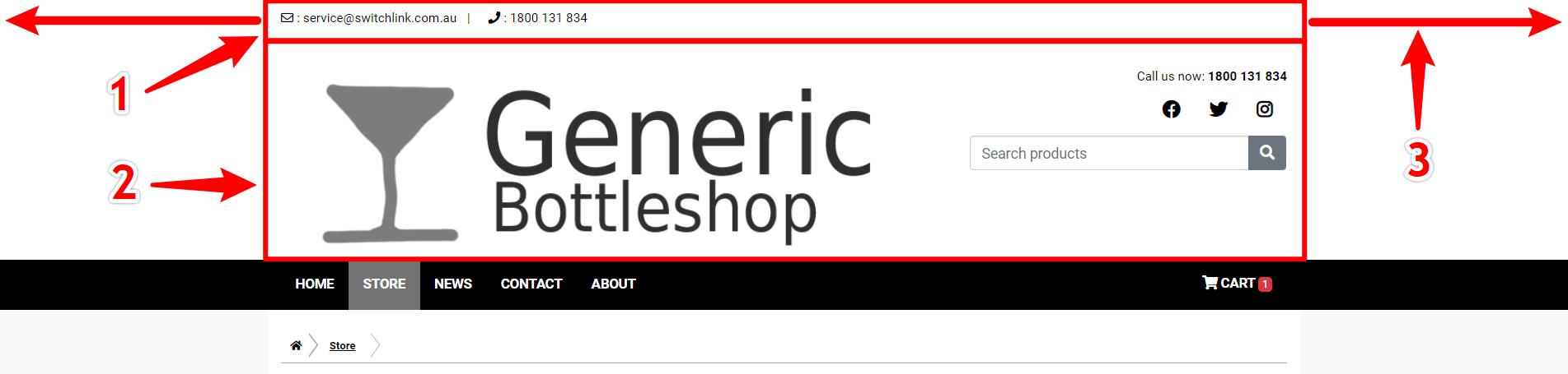 (1) Top Header, (2) Main Header, (3) Full Width
Body Styling Options
Body Styling Options
- Enable Full Body Width - Toggles the width of the body, to either have side margins or take the full width of the page.
- Body Background Colour - Change the colour that appears behind the main body using either a hex colour value or using the colour picker
- Background Image - Toggle whether an image appears in the background, behind the body.
- Background Image Url - The Url destination of an uploaded image which will appear as the background behind the body.
- Navigation Background Colour - The colour of the navigation bar. The text colour will automatically adjust depending upon whatever the provided colour is.
- Navigation Full Width - Toggle the width of the navigation bar, to either have side margins or take the full width of the page.
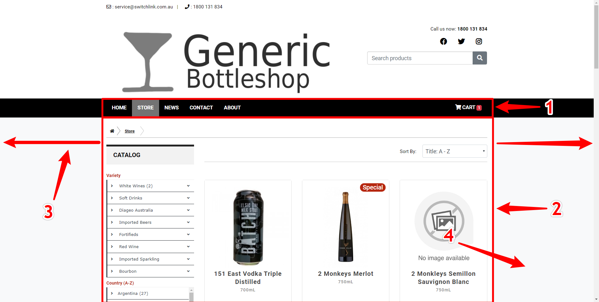
(1) Navbar, (2) Body, (3) Full Width, (4) Background
Footer Styling Options
Footer Styling Options
- Full Width Main Footer- Toggle the width of the main footer, to either have side margins or take the full width of the page.
- Main footer menu background colour - Change the colour of the main footer using either a hex colour value or by using the colour picker provided
- Main Footer number of columns - Change the number of footer information columns, the minimum being 1 and maximum being 4
- Column 1 to Column 4 - Edit the content of each footer column using the editor provided. Only the columns up to the number set in the Main Footer number of columns will be displayed.
- Enable Bottom Footer - Toggles the visibility of the bottom footer.
- Full Width Bottom Footer - Toggles the width of the bottom footer, to either have side margins or take the full width of the page.
- Bottom Footer Background Colour - Change the colour of the bottom footer using either a hex colour value or by using the colour picker provided.
- Bottom Footer Number of Columns - Change the number of bottom footer information columns, the minimum being 1 and maximum being 2.
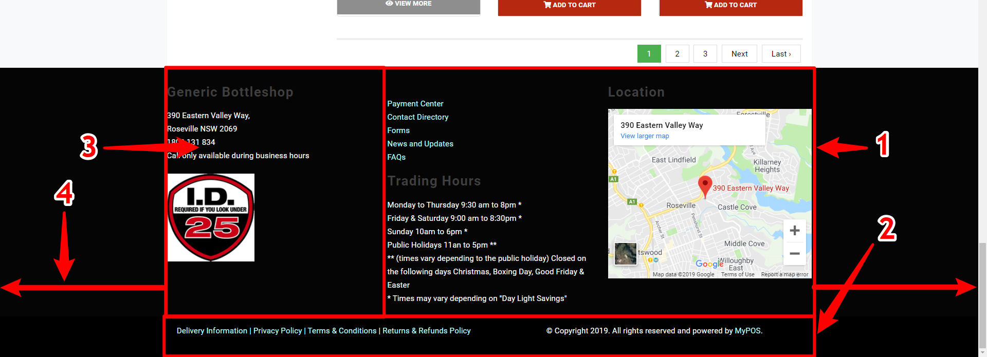
(1) Main Footer, (2) Bottom Footer, (3) Main Footer Column, (4) Full Width
Widget Templates
Template Options
There are a number of widget templates to be used, with varying degrees of customization.
- Products - This displays a widget with a limited number of filtered products. The Settings include: Default Display (Default category displayed, e.g. Specials, New), Show Tabs (Show options to switch filtered category), Columns (products per row), Rows (number of rows of products).
- Store News - This displays the Store News - this has no settings.
- Contact Form - A contact us form for users to fill in - this has no settings.
- Trading Hours - A table containing the trading hours of the business - this has no settings.
- World Map - A World map displaying different countries/regions to filter products by - this has no settings.
- Store Locator - A Map to display the location of the store - this has no settings.
- Contact Details - A table containing contact details of the business - this has no settings.
- Calendar - A list of events coming up at the venue - this has no settings.
- Message - A small customised message with an Icon to display a specific message to customers - Settings include: Color (Colour of the Icon), Message (the Message to be displayed), Icon (a font awesome icon name to be displayed with the message).
- Department Links - Links to different departments within the store - Settings include a Link, Name and Image for all four department links.
- Click & Collect - A small section explaining to customers how click and collect works - Settings include a colour for the icons for the click and collect.
- Jumbotron - A large banner that greets the user to the website - Settings include: an Image (Displayed as the background of the Jumbotron), a Colour Shade (colour that shades over the image), a Title and a Body which are displayed over the Jumbotron.
- Carousel - Also known as a Slider, this displayed a number of images with optional links - Settings include an image and link for each of the slides in the jumbotron, can be added dynamically.
- Layout - A Widget for creating widgets-within-widgets and organising them into columns - Settings are similar to that of the Edit Page Contents section but instead with two separate columns and a Layout Ratio setting.
- Custom - A blank canvas for any HTML code, recommended for advanced users only - Settings are a text editor which can be used to edit HTML.
Postcodes Within Radius Tool
Accessing the Tool
To access the "Find Australian Postcodes Inside Radius" Tool you can either click here or follow the link in the Add/View Store-Fulfilled Delivery Zone form.
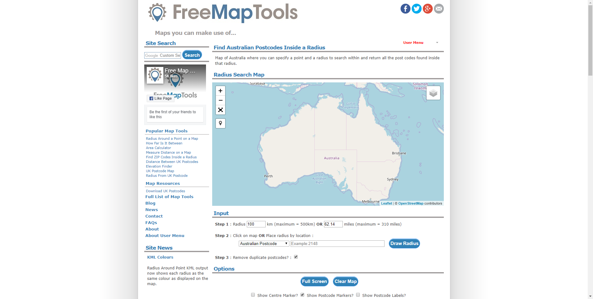
To use the tool simply enter a radius in step 1, then your own postcode in step 2, then click "Draw Radius".